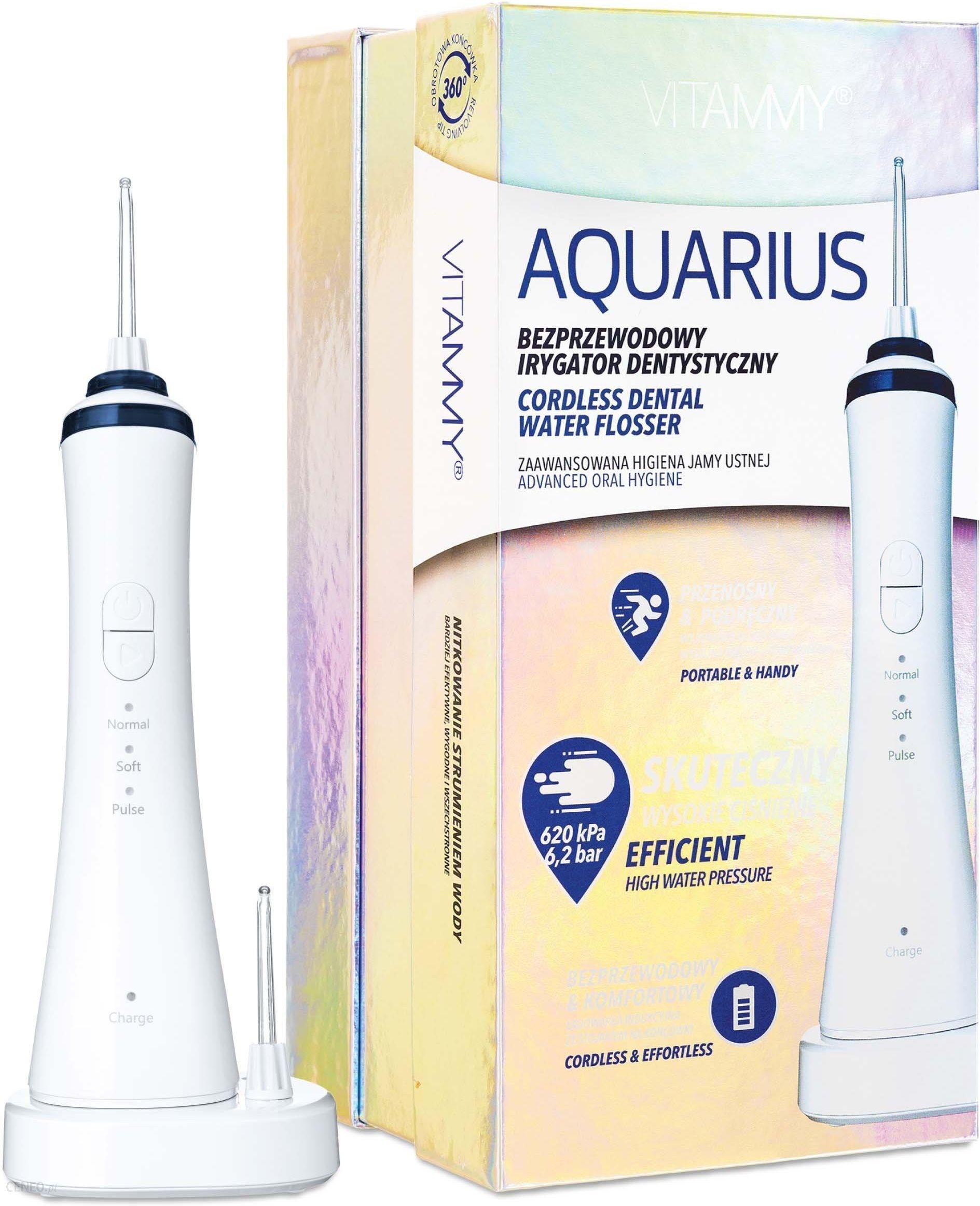
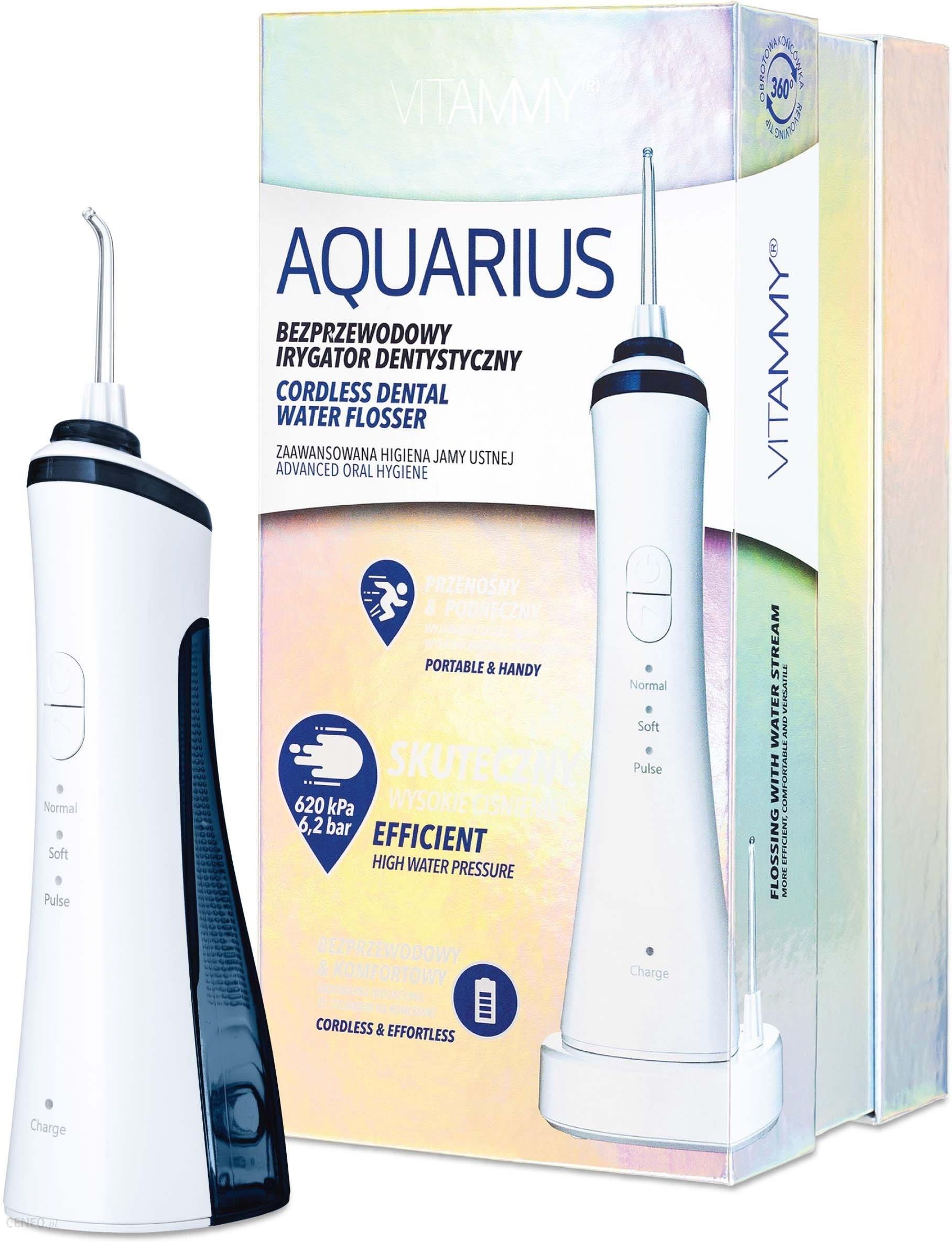
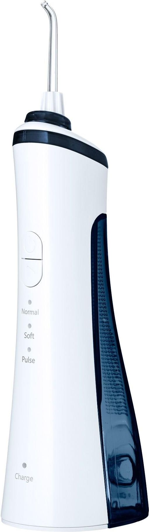
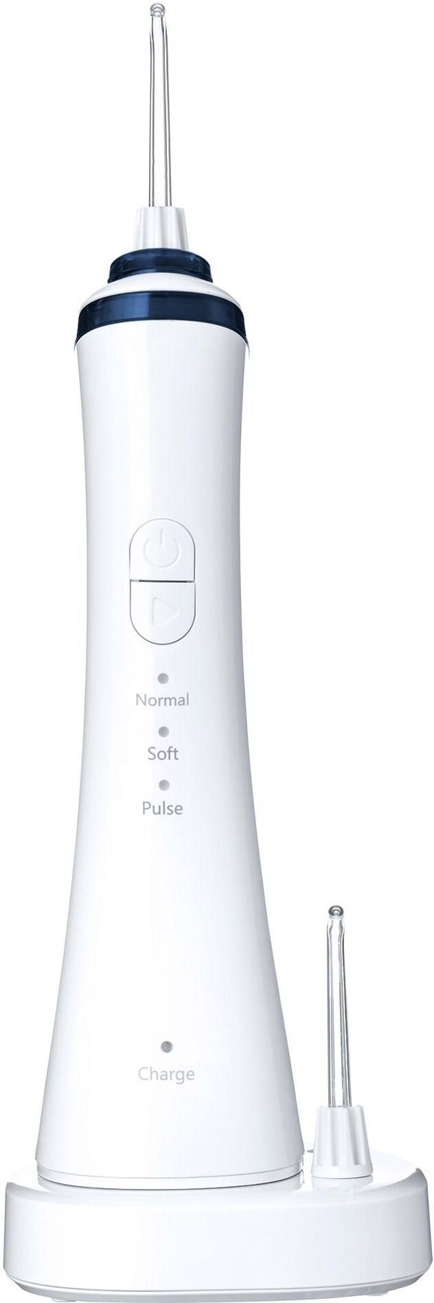
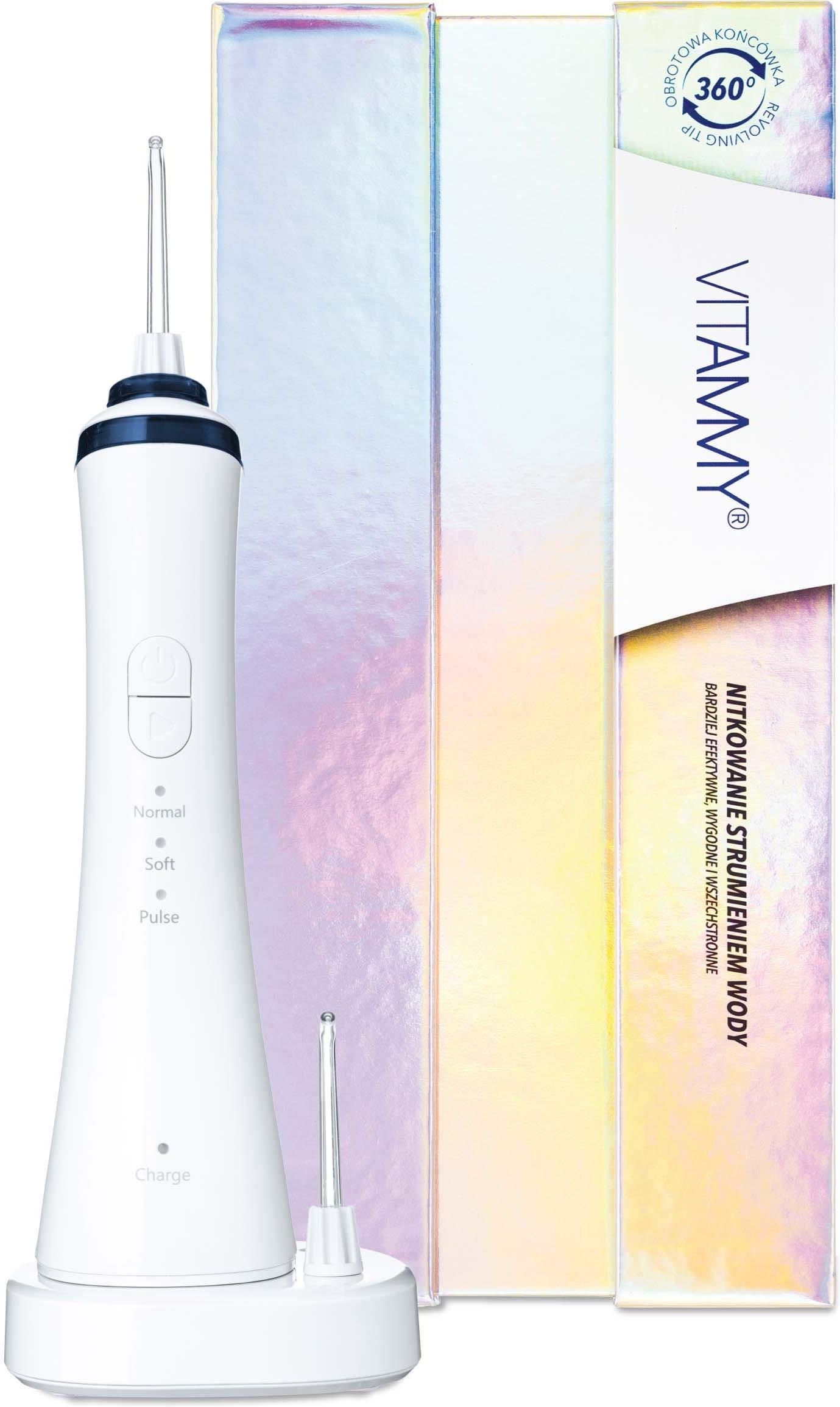
Vitammy Aquarius
203,16 zł
Zasilanie: Bezprzewodowe. Strumień: Pulsacyjny. Pojemność zbiornika: 150 ml.
(...) więcej
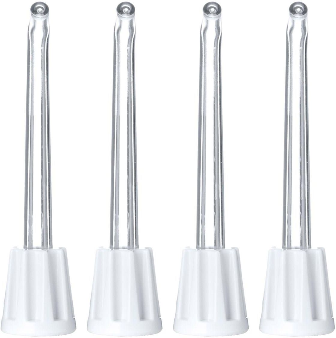
Liczba końcówek w zestawie: 2
mniej
Najlepsze wybrane oferty
Pozycja ofert z pogrubioną nazwą została opłacona przez kontrahenta. O kolejności prezentacji ofert decyduje mechanizm licytacji.
Oferty z zielonym tłem oraz ikoną są najtańsze.
Oferty oznaczone logiem "Ceneo - kup teraz" pochodzą od partnerów korzystających z usługi "Kup teraz", która umożliwia bezpośredni zakup produktów za pośrednictwem Ceneo.pl, z pominięciem strony sklepu sprzedawcy. Ceneo nie jest sklepem.
VITAMMY AQUARIUS Irygator bezprzewodowy do jamy ustnej, 3 tryby, IPX7, 4 końcówki
225,00 zł
Darmowa wysyłka
Irygator VITAMMY Aquarius
224,00 zł
Darmowa wysyłka
Irygator Vitammy Aquarius bezprzewodowy biały
203,16 zł
Vitammy Aquarius bezprzewodowy irygator dentystyczny 1 sztuka
212,89 zł
Irygator VITAMMY Aquarius
224,00 zł
Darmowa wysyłka
VITAMMY AQUARIUS Irygator bezprzewodowy do jamy ustnej, 3 tryby, IPX7, 4 końcówki
224,00 zł
VITAMMY AQUARIUS Irygator bezprzewodowy do jamy ustnej, 3 tryby, IPX7, 4 końcówki
224,00 zł
Vitammy Aquarius, irygator dentystyczny, bezprzewodowy, akumulatorowy, 1 sztuka
224,49 zł
Darmowa wysyłka
Pokaż wszystkie oferty (11)
Vitammy Aquarius - Najlepsze oferty
Pozycja ofert z pogrubioną nazwą została opłacona przez kontrahenta. O kolejności prezentacji ofert decyduje mechanizm licytacji.
Oferty z zielonym tłem oraz ikoną są najtańsze.
Oferty oznaczone logiem "Ceneo - kup teraz" pochodzą od partnerów korzystających z usługi "Kup teraz", która umożliwia bezpośredni zakup produktów za pośrednictwem Ceneo.pl, z pominięciem strony sklepu sprzedawcy. Ceneo nie jest sklepem.
Ukryj oferty
Vitammy Aquarius - Opis
@import url("https://fonts.googleapis.com/css2?family=Lato:wght@100;400;700;800;900&display=swap");@import url("https://fonts.googleapis.com/css2?family=Roboto:wght@100;400;500;700;900&display=swap");
.catalog-product-view .tabs-container #description .description{width:1420px !important; max-width:100%; }
.desc-text--main{width:1420px !important; max-width:100%; }
.hide-xs {
display: none;
}
.hide-sm {
display: block;
}
@media only screen and (min-width: 768px) {
.hide-xs {
display: block;
}
.hide-sm {
display: none;
}
}
.content-lp {
max-width: 1420px;
margin: 0 auto;
font-family: Lato !important;
overflow: hidden;
}
@media only screen and (min-width: 768px) {
.content-lp {
padding: 0 20px;
}
}
@media only screen and (min-width: 1420px) {
.content-lp {
padding: 0;
}
}
.content-lp a {
text-decoration: none !important;
}
.content-lp__header {
margin-top: 25px;
width: 100%;
padding: 0px 24.5px;
box-sizing: border-box;
}
.content-lp__header-logo img {
width: 80%;
max-width: 400px;
}
.content-lp__header-partner {
margin-top: 20px;
}
.content-lp__header-partner img {
height: 73px;
}
.content-lp__header-mobile img {
width: calc(100% + 40px);
margin-top: 30px;
margin-left: -20px;
margin-right: -20px;
margin-bottom: 40px;
}
@media only screen and (min-width: 768px) {
.content-lp__header {
margin-top: 25px;
background-image: (...) więcej url('https://novamed.pl/media/wysiwyg/Vitammy/aquarius/Aquarius_new/images__banner.png');
background-position: top right;
background-repeat: no-repeat;
background-size: 900px;
width: 100%;
padding: 30px 24.5px;
box-sizing: border-box;
}
.content-lp__header-partner {
margin-top: 168px;
}
.content-lp__header-logo img {
width: auto;
}
.content-lp__header-partner img {
max-width: 50%;
height: auto;
}
}
@media only screen and (min-width: 900px) {
.content-lp__header {
margin-top: 25px;
background-image: url('https://novamed.pl/media/wysiwyg/Vitammy/aquarius/Aquarius_new/images__banner.png');
background-position: top right;
background-repeat: no-repeat;
background-size: auto;
width: 100%;
height: 772px;
padding: 30px 24.5px;
box-sizing: border-box;
}
.content-lp__header-partner {
margin-top: 268px;
}
.content-lp__header-logo img {
max-width: 60%;
margin-top: 70px;
}
}
@media only screen and (min-width: 1110px) {
.content-lp__header-logo img {
max-width: 50%;
}
.content-lp__header-partner img {
max-width: 80%;
}
}
@media only screen and (min-width: 1280px) {
.content-lp__header {
padding: 30px 124.5px;
}
.content-lp__header-logo img {
max-width: none;
margin-top: 0px;
}
.content-lp__header-partner img {
max-width: none;
}
}
.content-lp__navi {
display: flex;
justify-content: center;
align-items: center;
align-content: center;
gap: 0px 20px;
align-self: stretch;
flex-wrap: wrap;
}
.content-lp__navi-item {
width: 45%;
height: 220px;
flex-direction: column;
justify-content: center;
align-items: center;
display: flex;
color: var(--Niebieski-Aquarius, #124592);
text-align: center;
font-family: Lato;
font-size: 14px;
font-style: normal;
font-weight: 700;
line-height: 21px;
text-transform: uppercase;
transition: all .3s ease-in-out;
cursor: pointer;
}
.content-lp__navi-item img {
max-width: 66px;
margin-bottom: 10px;
}
@media only screen and (min-width: 768px) {
.content-lp__navi-item {
width: 200px;
height: 300px;
font-size: 20px;
line-height: 30px;
}
.content-lp__navi {
gap: 0px 50px;
}
.content-lp__navi-item img {
max-width: none;
}
}
@media only screen and (min-width: 1024px) {
.content-lp__navi-item:hover {
transform: scale(1.075);
transition: all .3s ease-in-out;
}
}
@media only screen and (min-width: 1280px) {
.content-lp__navi-item {
width: 250px;
height: 340px;
}
}
.content-lp__navi-item-description {
height: 150px;
}
.content-lp__middle-header {
color: var(--Niebieski-Aquarius, #124592);
text-align: center;
font-family: Lato;
font-size: 26px;
font-style: normal;
font-weight: 700;
line-height: 26px;
text-transform: uppercase;
display: flex;
flex-direction: column;
}
.content-lp__middle-header .small {
font-size: 24px;
font-style: normal;
font-weight: 600;
line-height: 24px;
}
@media only screen and (min-width: 768px) {
.content-lp__middle-header {
font-size: 34px;
line-height: 34px;
}
.content-lp__middle-header .small {
font-size: 30px;
font-style: normal;
font-weight: 600;
line-height: 30px;
}
}
.content-lp__middle-sepator img {
max-width: 100%;
margin-bottom: 25px;
margin-top: 25px;
}
.content-lp__middle-content-middle {
text-align: center;
}
.content-lp__middle-content-middle img {
max-width: 50%;
}
@media only screen and (min-width: 768px) {
.content-lp__middle-sepator img {
max-width: 100%;
margin-bottom: 30px;
}
}
@media only screen and (min-width: 1024px) {
.content-lp__middle-sepator {
position: relative;
top: -40px;
}
.content-lp__middle-content-middle img {
max-width: none;
}
.content-lp__middle-sepator img {
max-width: none;
margin-bottom: 0;
}
}
.content-lp__middle-content {
display: flex;
align-items: center;
position: relative;
flex-direction: column;
gap: 30px;
}
.content-lp__middle-content-left p,
.content-lp__middle-content-right p {
max-width: 500px;
margin: 0px 20px 20px 20px;
}
.content-lp__middle-content-left,
.content-lp__middle-content-right {
color: #000;
font-family: Lato;
font-size: 16px;
font-style: normal;
line-height: 24px;
text-align: center;
flex: 1;
}
@media only screen and (min-width: 768px) {
.content-lp__middle-content-left p,
.content-lp__middle-content-right p {
max-width: 500px;
margin: 0px auto 20px auto;
}
.content-lp__middle-content-left,
.content-lp__middle-content-right {
font-size: 20px;
line-height: 30px;
}
}
.content-lp__middle-footer {
margin: 40px 0;
text-align: center;
}
@media only screen and (min-width: 1024px) {
.content-lp__middle-content {
display: flex;
align-items: center;
position: relative;
top: -140px;
margin-bottom: -140px;
flex-direction: row;
gap: 0;
}
.content-lp__middle-content-left p,
.content-lp__middle-content-right p {
max-width: 350px;
margin: 0px auto 20px auto;
}
}
.content-lp__middle-footer strong {
color: var(--Niebieski-Aquarius, #124592);
text-align: center;
font-family: Lato;
font-size: 24px;
font-style: normal;
font-weight: 600;
line-height: 24px;
text-transform: uppercase;
}
.content-lp__middle-footer p {
max-width: 762px;
margin: 10px auto;
color: #000;
text-align: center;
font-family: Lato;
font-size: 16px;
font-style: normal;
line-height: 24px;
padding: 0 20px;
}
@media only screen and (min-width: 768px) {
.content-lp__middle-footer strong {
font-size: 30px;
font-weight: 600;
line-height: 30px;
}
.content-lp__middle-footer p {
font-size: 20px;
line-height: 30px;
}
}
.content-lp__box {
border-radius: 100px;
background: var(--Moduy-to, rgba(244, 244, 244, 0.50));
max-width: 1300px;
box-sizing: border-box;
position: relative;
padding: 35px 30px;
text-align: center;
margin-bottom: 30px;
display: flex;
flex-direction: column;
gap: 30px;
margin-left: 15px;
margin-right: 15px;
}
@media only screen and (min-width: 768px) {
.content-lp__box {
padding: 40px 30px;
}
}
@media only screen and (min-width: 1024px) {
.content-lp__box {
text-align: left;
margin-bottom: 0;
padding-left: 50px;
margin-left: auto;
margin-right: auto;
}
.content-lp__box.padding-25 {
padding-top: 25px;
padding-bottom: 25px;
margin: 45px auto;
}
.content-lp__box.padding-40 {
padding-top: 35px;
padding-bottom: 35px;
margin: 65px auto;
}
.content-lp__box.padding-60 {
padding-top: 55px;
padding-bottom: 55px;
margin: 140px auto 100px;
}
.content-lp__box.padding-70 {
padding-top: 70px;
padding-bottom: 70px;
margin: 130px auto;
}
.content-lp__box.padding-100 {
padding-top: 100px;
padding-bottom: 100px;
margin: 130px auto;
}
.content-lp__box.padding-100-70 {
padding-top: 100px;
padding-bottom: 70px;
margin: 130px auto 140px;
}
}
@media only screen and (min-width: 1280px) {
.content-lp__box {
padding-left: 125px;
}
}
.content-lp__box-left-title {
color: var(--Niebieski-Aquarius, #124592);
font-family: Lato;
font-size: 24px;
font-style: normal;
font-weight: 600;
line-height: 24px;
text-transform: uppercase;
margin-bottom: 10px;
}
.title-small {
font-size: 16px;
font-style: normal;
font-weight: 400;
line-height: 24px;
}
.content-lp__box p {
color: #000;
font-family: Lato;
font-size: 16px;
font-style: normal;
font-weight: 400;
line-height: 24px;
}
@media only screen and (min-width: 768px) {
.content-lp__box-left-title {
font-size: 30px;
font-style: normal;
font-weight: 600;
line-height: 30px;
}
.title-small {
font-size: 20px;
font-style: normal;
font-weight: 400;
line-height: 30px;
}
.content-lp__box p {
font-size: 20px;
font-style: normal;
font-weight: 400;
line-height: 30px;
}
}
.content-lp__box-right img {
max-width: 80%;
}
@media only screen and (min-width: 768px) {
.content-lp__box-right img {
max-width: 50%;
}
}
@media only screen and (min-width: 1024px) {
.content-lp__box-left {
max-width: 55%;
}
.content-lp__box-right img {
max-width: none;
}
.content-lp__box-right.box-1 {
position: absolute;
top: -60px;
right: 20px;
}
.content-lp__box-right.box-2 {
position: absolute;
top: -5px;
right: 20px;
}
.content-lp__box-right.box-3 {
position: absolute;
top: -30px;
right: 120px;
}
.content-lp__box-right.box-4 {
position: absolute;
top: -10px;
right: 20px;
}
.content-lp__box-right.box-5 {
position: absolute;
top: -20px;
right: 20px;
}
.content-lp__box-right.box-6 {
position: absolute;
top: -15px;
right: 20px;
}
}
@media only screen and (min-width: 1280px) {
.content-lp__box-left {
max-width: 620px;
}
.content-lp__box-right.box-1 {
position: absolute;
top: -60px;
right: 85px;
}
.content-lp__box-right.box-2 {
position: absolute;
top: -20px;
right: 57px;
}
.content-lp__box-right.box-3 {
position: absolute;
top: -30px;
right: 200px;
}
.content-lp__box-right.box-4 {
position: absolute;
top: -30px;
right: 100px;
}
.content-lp__box-right.box-5 {
position: absolute;
top: -20px;
right: 85px;
}
.content-lp__box-right.box-6 {
position: absolute;
top: -35px;
right: 85px;
}
}
.content-lp__banner {
text-align: center;
margin-bottom: 40px;
display: flex;
gap: 30px;
flex-direction: column-reverse;
}
@media only screen and (min-width: 768px) {
.content-lp__banner {
display: block;
margin-bottom: 50px;
}
}
@media only screen and (min-width: 1024px) {
.content-lp__banner {
text-align: center;
margin-bottom: 0px;
}
}
.content-lp__banner-image img {
max-width: 100%;
}
.content-lp__banner-content {
color: #000;
text-align: center;
font-family: Lato;
font-size: 16px;
font-style: normal;
font-weight: 400;
line-height: 24px;
max-width: 762px;
margin: 0 20px;
}
.content-lp__banner-content-title {
color: var(--Niebieski-Aquarius, #124592);
text-align: center;
font-family: Lato;
font-size: 24px;
font-style: normal;
font-weight: 600;
line-height: 24px;
text-transform: uppercase;
margin: 20px 0px;
}
@media only screen and (min-width: 768px) {
.content-lp__banner-content {
font-size: 20px;
font-style: normal;
font-weight: 400;
line-height: 30px;
margin: 0 auto;
}
.content-lp__banner-content-title {
font-size: 30px;
font-style: normal;
font-weight: 600;
line-height: 30px;
}
}
.content-lp__instruction-header {
color: var(--Niebieski-Aquarius, #124592);
text-align: center;
font-family: Lato;
font-size: 24px;
font-style: normal;
font-weight: 600;
line-height: 24px;
text-transform: uppercase;
margin: 50px 0 30px;
}
.content-lp__instruction-steps {
display: flex;
gap: 30px;
justify-content: center;
align-items: flex-start;
align-content: flex-start;
color: #000;
text-align: center;
font-family: Lato;
font-size: 16px;
font-style: normal;
font-weight: 400;
line-height: 24px;
flex-wrap: wrap;
}
.content-lp__instruction-steps-item {
width: 100%;
}
@media only screen and (min-width: 768px) {
.content-lp__instruction-header {
font-size: 30px;
font-style: normal;
font-weight: 600;
line-height: 30px;
margin: 30px 0;
}
.content-lp__instruction-steps {
gap: 30px;
font-size: 20px;
font-weight: 400;
line-height: 30px;
}
.content-lp__instruction-steps-item {
width: 45%;
}
}
@media only screen and (min-width: 1280px) {
.content-lp__instruction-steps-item {
width: auto;
}
}
.content-lp__instruction-steps p {
max-width: 250px;
margin: 0 auto;
}
.content-lp__set-header {
color: var(--Niebieski-Aquarius, #124592);
text-align: center;
font-family: Lato;
font-size: 24px;
font-style: normal;
font-weight: 600;
line-height: 24px;
text-transform: uppercase;
margin: 50px 0 10px;
}
.content-lp__set-content {
display: flex;
justify-content: center;
gap: 40px;
align-items: center;
color: #000;
font-family: Lato;
font-size: 16px;
font-style: normal;
font-weight: 400;
line-height: 24px;
margin-bottom: 30px;
flex-direction: column;
text-align: center;
}
.content-lp__set-content img {
max-width: 100%;
}
.content-lp__set-content ul {
text-align: left;
}
@media only screen and (min-width: 768px) {
.content-lp__set-header {
font-size: 30px;
font-style: normal;
font-weight: 600;
line-height: 30px;
margin: 100px 0 10px;
}
.content-lp__set-content {
gap: 40px;
font-size: 20px;
line-height: 30px;
margin-bottom: 30px;
}
}
@media only screen and (min-width: 1024px) {
.content-lp__set-content {
flex-direction: row;
text-align: left;
}
}
.content-lp__parts {
margin: 30px 0 20px;
}
.content-lp__parts-title {
color: var(--Niebieski-Aquarius, #124592);
text-align: center;
font-family: Lato;
font-size: 24px;
font-style: normal;
font-weight: 600;
line-height: 24px;
text-transform: uppercase;
margin: 50px 0;
}
.content-lp__parts-item {
display: flex;
align-items: center;
gap: 15px;
margin-bottom: 25px;
flex-direction: column;
}
@media only screen and (min-width: 768px) {
.content-lp__parts {
margin: 100px 0 20px;
}
.content-lp__parts-title {
color: var(--Niebieski-Aquarius, #124592);
text-align: center;
font-family: Lato;
font-size: 30px;
font-style: normal;
font-weight: 600;
line-height: 30px;
text-transform: uppercase;
margin: 50px 0;
}
.content-lp__parts-item {
display: flex;
align-items: center;
gap: 50px;
margin-bottom: 25px;
flex-direction: row;
}
}
@media only screen and (min-width: 1280px) {
.content-lp__parts-item {
gap: 100px;
}
}
.content-lp__parts-item-left {
max-width: 80%;
}
.content-lp__parts-item-left img {
max-width: 100%;
}
@media only screen and (min-width: 768px) {
.content-lp__parts-item-left {
max-width: 50%;
}
.content-lp__parts-item-left img {
max-width: 100%;
}
}
@media only screen and (min-width: 1024px) {
.content-lp__parts-item-left {
max-width: 60%;
}
}
@media only screen and (min-width: 1280px) {
.content-lp__parts-item-left {
max-width: none;
}
}
.content-lp__parts-item-right {
width: 350px;
color: #000;
text-align: center;
font-family: Lato;
font-size: 16px;
font-style: normal;
line-height: 24px;
}
.content-lp__parts-click {
display: flex;
gap: 15px;
justify-content: center;
margin-top: 40px;
margin-bottom: 50px;
flex-direction: column;
padding-left: 20px;
padding-right: 20px;
}
.content-lp__parts-click-mobile {
display: flex;
gap: 15px;
justify-content: center;
text-align: center;
}
@media only screen and (min-width: 768px) {
.content-lp__parts-click-mobile {
display: none;
}
.content-lp__parts-item-right {
width: 350px;
color: #000;
text-align: right;
font-family: Lato;
font-size: 20px;
font-style: normal;
line-height: 30px;
}
.content-lp__parts-click {
display: flex;
gap: 30px;
justify-content: center;
margin-top: 40px;
margin-bottom: 50px;
flex-direction: row;
}
}
@media only screen and (min-width: 1024px) {
.content-lp__parts-click {
margin-top: 60px;
margin-bottom: 0;
}
}
.content-lp__parts-click p {
text-align: center;
font-family: Lato;
font-size: 16px;
font-style: normal;
line-height: 24px;
}
@media only screen and (min-width: 768px) {
.content-lp__parts-click p {
width: 550px;
text-align: center;
font-family: Lato;
font-size: 20px;
font-style: normal;
line-height: 30px;
}
}
.content-lp__interactive-button {
display: flex;
align-items: center;
gap: 25px;
color: var(--Niebieski-Aquarius, #124592);
font-family: Lato;
font-size: 12px;
font-style: normal;
font-weight: 400;
line-height: 24px;
text-decoration-line: underline;
text-decoration-style: solid;
text-decoration-skip-ink: auto;
text-decoration-thickness: auto;
text-underline-offset: auto;
text-underline-position: from-font;
cursor: pointer;
justify-content: center;
margin-bottom: 30px;
}
.content-lp__interactive-button .icon__obrot {
background-image: url('https://novamed.pl/media/wysiwyg/Vitammy/aquarius/Aquarius_new/budowa/obrot.svg');
background-repeat: no-repeat;
background-size: contain;
width: 50px;
height: 70px;
position: relative;
}
.content-lp__interactive-button .icon__obrot::after {
content: "";
position: absolute;
top: 0;
left: 0;
width: 100%;
height: 100%;
background-image: url('https://novamed.pl/media/wysiwyg/Vitammy/aquarius/Aquarius_new/budowa/obrot-hover.svg');
background-repeat: no-repeat;
background-size: contain;
opacity: 0;
animation: fadeInOut 3.2s ease-in-out infinite;
z-index: 2;
}
@keyframes fadeInOut {
0% {
opacity: 0;
}
10% {
opacity: 0.1;
}
20% {
opacity: 0.2;
}
30% {
opacity: 0.3;
}
40% {
opacity: 0.4;
}
50% {
opacity: 0.5;
}
60% {
opacity: 0.4;
}
70% {
opacity: 0.3;
}
80% {
opacity: 0.2;
}
90% {
opacity: 0.1;
}
100% {
opacity: 0;
}
}
@media only screen and (min-width: 768px) {
.content-lp__interactive-button {
position: absolute;
z-index: 2;
justify-content: flex-start;
line-height: 30px;
font-size: 16px;
margin-bottom: 0;
}
}
@media only screen and (min-width: 1024px) {
.content-lp__interactive-button {
font-size: 20px;
}
.content-lp__interactive-button .icon__obrot {
width: 100px;
height: 140px;
}
}
.content-lp__interactive {
position: relative;
margin: 30px 0;
}
.content-lp__interactive-device {
position: relative;
width: 100%;
max-width: 360px;
margin: 0 auto;
}
@media only screen and (min-width: 768px) {
.content-lp__interactive-device {
max-width: none;
}
}
@media only screen and (min-width: 1400px) {
.content-lp__interactive-device {
margin-left: 132px;
}
.content-lp__interactive {
position: relative;
margin: 50px 0;
}
}
.content-lp__interactive-device img.device {
height: 1000px;
}
.line-1 {
position: absolute;
top: 27px;
left: 204px;
}
.line-2 {
position: absolute;
top: 97px;
left: 182px;
}
.line-3 {
position: absolute;
top: 116px;
left: 138px;
}
.line-4 {
position: absolute;
top: 139px;
left: 122px;
}
.line-5 {
position: absolute;
top: 178px;
left: 103px;
}
.line-6 {
position: absolute;
left: 93px;
top: 305px;
}
.line-7 {
position: absolute;
left: 155px;
top: 174px;
}
.line-8 {
position: absolute;
left: 114px;
top: 237px;
}
.line-9 {
position: absolute;
left: 114px;
top: 328px;
}
.description-device {
color: var(--Niebieski-Aquarius, #124592);
font-family: Lato;
font-size: 12px;
font-style: normal;
font-weight: 600;
line-height: 24px;
position: absolute;
left: 210px;
cursor: pointer;
text-align: right;
width: 122px;
}
.device {
width: 200px;
height: 375px;
background-image: url('https://novamed.pl/media/wysiwyg/Vitammy/aquarius/Aquarius_new/budowa/irygator_przod.png');
background-size: contain;
background-repeat: no-repeat;
background-position: center;
transition: background-image 0.3s ease-in-out;
}
.content-lp__interactive-device-back .device {
background-image: url('https://novamed.pl/media/wysiwyg/Vitammy/aquarius/Aquarius_new/budowa/irygator_tyl.png');
}
@media only screen and (min-width: 768px) {
.device {
width: 550px;
height: 1000px;
}
.description-device {
left: 691px;
font-size: 20px;
min-width: 200px;
line-height: 32px;
text-transform: uppercase;
text-align: left;
width: auto;
}
}
@media only screen and (min-width: 768px) and (max-width: 1024px) {
.content-lp__interactive-device {
transform: scale(0.8);
margin: 0 auto;
left: -100px;
right: 0;
height: 900px;
top: -50px;
width: 100%;
}
}
@media only screen and (min-width: 1024px) {
.description-device {
color: var(--Niebieski-Aquarius, #124592);
font-family: Lato;
font-size: 20px;
font-style: normal;
font-weight: 600;
line-height: 32px;
text-transform: uppercase;
position: absolute;
left: 691px;
cursor: pointer;
}
}
@media only screen and (mi mniej
Vitammy Aquarius - Opinie i recenzje
Na liście znajdują się opinie, które zostały zweryfikowane (potwierdzone zakupem) i oznaczone są one zielonym znakiem Zaufanych Opinii. Opinie niezweryfikowane nie posiadają wskazanego oznaczenia.
Vitammy Aquarius - Podobne produkty
Produkty rekomendowane przez Taniomania
Oral-B
Oral-B Professional Care Oxy Jet
Oral-B Professional Care Oxy Jet
Oral-B
294,99 zł
Waterpik
Waterpik WP-580 Cordless Advanced 2.0
Waterpik WP-580 Cordless Advanced 2.0
Waterpik
479,00 zł
Philips
PHILIPS Sonicare Power Flosser 7000 HX3911/40
PHILIPS Sonicare Power Flosser 7000 HX3911/40
Philips
699,00 zł
Oral-B
Oral-B MicroJet Power 6 + Końcówki 8szt.
Oral-B MicroJet Power 6 + Końcówki 8szt.
Oral-B
369,00 zł
Waterpik
Waterpik WP-450EU Cordless Plus
Waterpik WP-450EU Cordless Plus
Waterpik
329,00 zł
Waterpik
Waterpik PP-100E, końcówki poddziąsłowe do irygatora Waterpik, 2 szt
Waterpik PP-100E, końcówki poddziąsłowe do irygatora Waterpik, 2 szt
Waterpik
44,59 zł
HanksAir
Bezprzewodowy przenośny irygator do zębów HanksAir
Bezprzewodowy przenośny irygator do zębów HanksAir
HanksAir
80,90 zł
CeneoAI
- 2024-09-24d...o
- 2021-12-15o...k
- 2021-10-13